
The goal of a graph on Excel is to make the information clear and easy for everyone to understand. In other words, it will make it easier for us to interpret reports and analyze complex data. Let’s start with how to make a graph on Excel.
What is a graph in Excel?
A chart in Excel is a graphical representation of numerical data where the data is represented by symbols such as bars, columns, lines, sectors, etc.
Graphs in Excel are useful for better understanding the relationships between large amounts of data or different subsets of data.
The features of a good graph in Excel are:
- It helps you visually describe the values or data you want to analyze.
- It is self-explanatory, that is, easy to understand. It basically requires no additional declarations to understand or parse the values.
- Indicates the units in which the values are expressed.
- Contains legends that detail the content of the graph.
- It is totally clean, without elements or colors that generate distractions.
Learn how to make a graph on Excel
- Select your entered data.
- Go to Insert tab > Click a chart type you want to make from the Chart group.
A step-by-step guide to making a graph on Excel
To make a graph on Excel, start by entering your numerical data into a spreadsheet, and then continue with the following steps.
Step-1. Prepare the data to make a graph on Excel
For most Excel graphs, such as bar graphs or column graphs, no special data layout is required. You can arrange the data in rows or columns, and Microsoft Excel will automatically determine the best way to plot the data on the graph (you can change this later).
To make an attractive Excel graph, the following points might be helpful:
- The column headers or the data in the first column are used in the chart legend. Excel automatically chooses the data for the legend based on the data layout.
- The data in the first column (or column headers) is used as labels along the X-axis of the graph.
- Numeric data from other columns is used to create the labels for the Y axis.
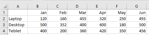
In this example, we are going to make a graph based on the following table.
Step-2. Select the data you want to include in the graph
Select all the data you want to include in the Excel graph. Make sure to select column headers if you want them to appear in the chart legend or axis labels.
Step-3. Insert the graph into the Excel spreadsheet
To insert the graph to the current sheet, go to Insert tab > Charts group and click a chart type you want to make. A graph will be inserted into Excel with the element.

For more graph types, click the More Column Charts… link at the bottom. The Insert Chart dialog box will open and you will see a list of available column chart subtypes at the top. You can also choose other graph types on the left side of the dialog.
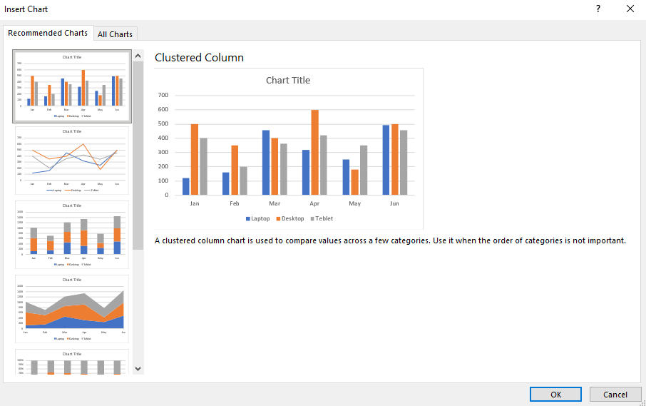
In Excel 2013 and later versions of Excel, you can click the Recommended Charts button to see a gallery of pre-configured graphs that best match your selected data.
You can create reports or summarize a large amount of data, easily interpreted, using different types of graphs in Excel such as the ones we will see below.
Learn what types of graphs on Excel and when to use them
Excel has always been known for being a very complete tool and one strength of Microsoft Excel is its graphics. In this section, we will explain what are the types of graphs in Excel that you can make.
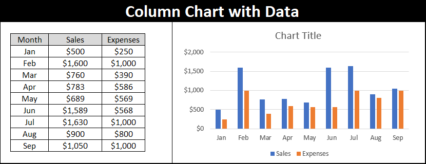
Column Charts
Column charts are useful for showing alternating data comparisons between items, particularly across different categories. The data in each column appears horizontally and the values vertically.
Line Charts
Line charts display a series as a set of points connected by single or multiple lines. They allow identifying trends or changes over time. This graph is recommended when we have any time references such as days, years, months, hours, etc.
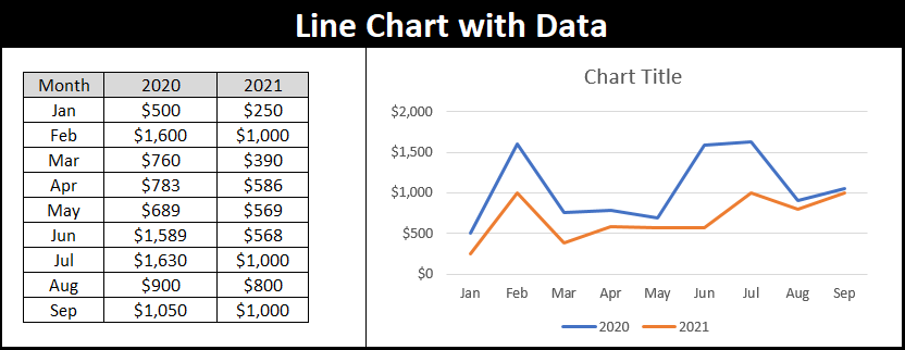
To this type of graph, we can add markers to the values to identify them more easily.
Pie Charts
They show the size of items in a data series proportional to the sum of all items. Allows you to view how much the “piece” represents in total, as a percentage of 100%.
This type of chart is a good choice when there is only one data series, and when the values are all positive and not null.
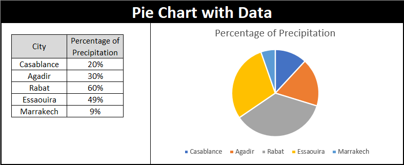
Note that, avoid opting for the pie chart when the analysis is more than seven categories, as in this case the visualization and understanding of the chart will be impaired.
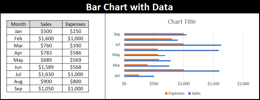
Bar Charts
The bar chart is very similar to the column chart, the difference is that it is displayed horizontally. The categories appear on the vertical axis. These graphs can make comparisons between individual data, just like the column chart.
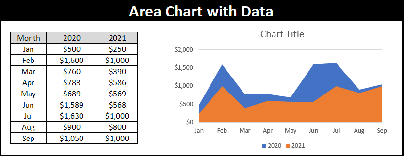
Area Charts
Area charts are very interesting but rarely used. You can commonly use them in the data variations of continuous periods.
As you can see in the following image, area charts allow you to represent the series as values and make a comparison of these values, between periods or categories.
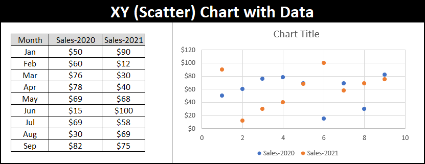
XY (Scatter) Charts
These charts are used to show the relationship between different data points. They use numerical values for both axes instead of using categories on one axis, as the graphs seen above do.
Map Charts
The map chart recognizes countries, states/provinces, counties, and zip codes in data labels, and it displays the appropriate map and places values in the appropriate areas on the map.
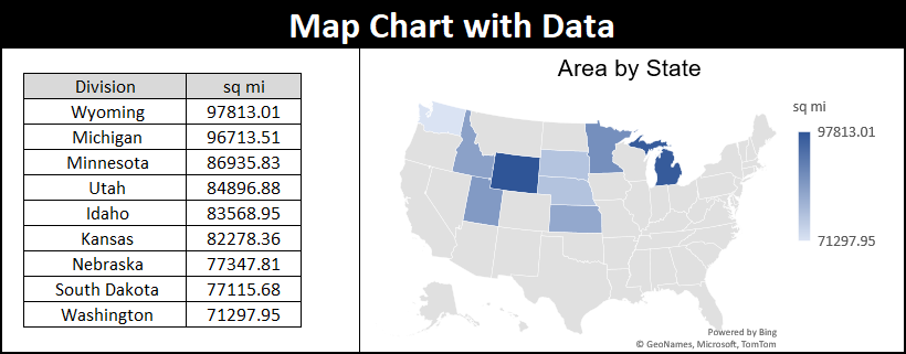
A populated map graphic makes it easy to view location-based information.
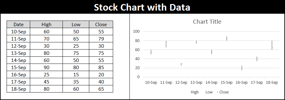
Stock Charts
As its name suggests, this type of chart is most often used to explain the change in stock price. You can use a Stock chart to display the fluctuation of stock prices. The types of stock charts are:
- High-Low-Close
- Open-High-Low-Close
- Volume-high-low-close and
- Volume-open-high-low-close.
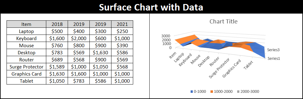
Surface Charts
Surface charts allow two elements to be linked and present a three-dimensional surface connecting the different points.
They are very useful when we are looking for optimal combinations between two data points. An identical color identifies the points of the same range of values to understand them as well as possible with a simple glance.
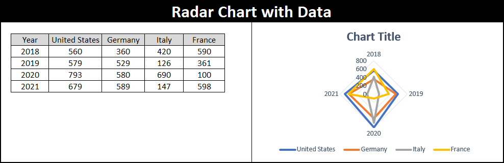
Radar Charts
This type of graph can represent data organized only in columns or in rows of a spreadsheet. In them, we can compare aggregated values of various data series. We can differentiate between the marker and fill radials.
Treemap Charts
A treemap chart represents multiple data points as part of a whole, like a pie chart or sunburst does, but it uses rectangles instead of slices or rings. This type of graph is available in Excel 2016 and later versions only.
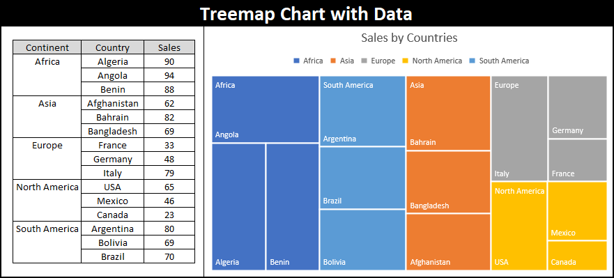
Rectangles represent several data points.
Sunburst Charts
The Sunburst chart looks like a donut chart, but rather than each ring representing a separate data series, each ring represents a level in the hierarchy. The center circle is the top level, and the farther you go, the further down the hierarchy you go.
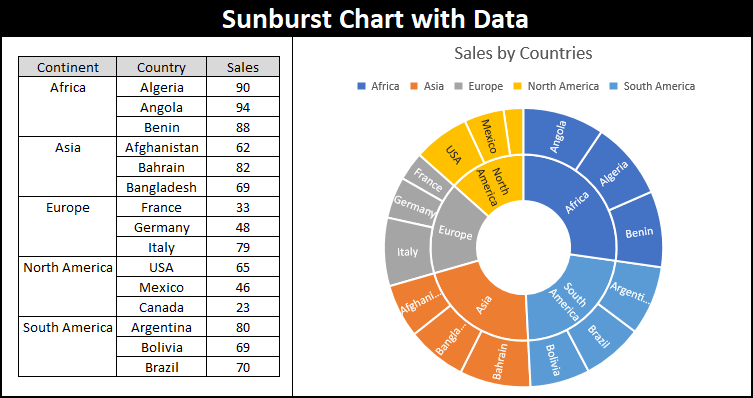
In a sunburst chart, each ring represents a hierarchy level. This type of graph is available in Excel 2016 and later versions only.
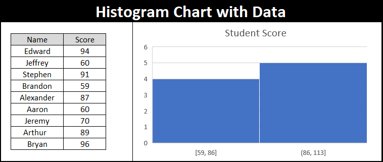
Histogram Charts
A histogram is a graphical representation of the database in the form of vertical bars. This chart is used to represent continuous databases. They are used to getting an overview of the numerical data distribution. The height of the bars is proportional to the absolute or relative frequency of the data intervals. This type of graph is available in Excel 2016 and later versions only.
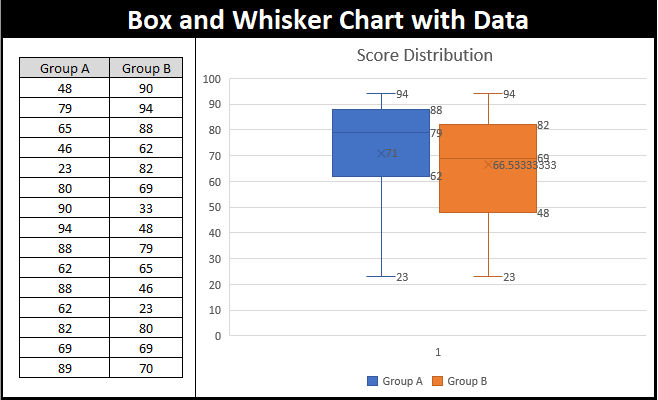
Box & Whisker Charts
Box-Whisker charts (box plots or box and whiskers) are a visual presentation that describes several important features at the same time, such as spread and symmetry.
The Box and Whiskers plot consists of a box. The box itself is the first region between the first and third quartiles. The line that divides the box into the 1st quartile and the 3rd quartile. The row itself is the median of the entire data set. The bottom line of the box is the median of the first quartile and the top line of the box is the median of the second half (3rd quartile).
X or cross represents the mean of the data. All values that exceed the first and third quartiles are shown as whiskers. They are basically the minimum (0th percentage) and maximum (100th percentage) in the data. This type of graph is available in Excel 2016 and later versions only.
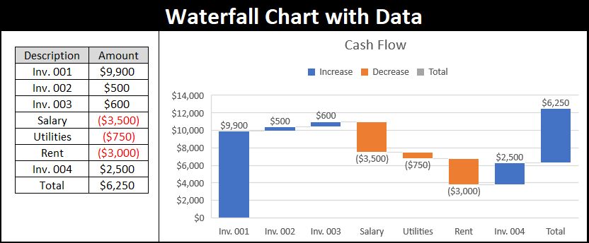
Waterfall Charts
Waterfall charts show a running total as values are added or subtracted. They are very useful for understanding how an initial value is affected by a series of positive and negative values. This type of graph is available in Excel 2016 and later versions only.
Funnel Charts
A funnel chart is used to visually represent increasing or decreasing values of multiple stages in a process. This chart represents the total area 100% like pie charts.
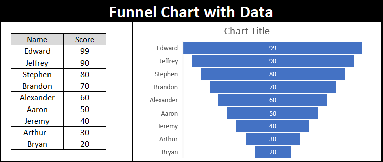
In most cases, this chart is used to represent a progression process. This feature is available from Excel version 2019 and in Office 365.
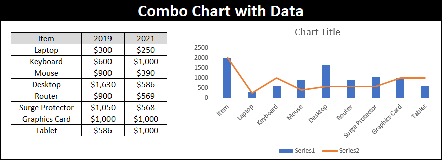
Combo Charts
Combo charts allow you to combine two types of charts into one to emphasize similarities or differences between data series. It is normally used to compare completely different variables. This type of graph is available in Excel 2013 and later versions only.
FAQ: How to make a graph on Excel
How to make a percentage chart in Excel?
As we saw before, the charts that reflect the percentages of a database concerning the total are circular charts or ring charts. Both charts automatically assign the percentage that corresponds to each category.
What are multiple charts in Excel?
Multiple charts or combined chart is join two types of charts into one. Generally, the column chart and the line chart are used to represent a different series of data.
How to create a dynamic chart?
At this time, you need to create a table of data. Select a cell in the table. Then click Insert > click PivotChart in the chart area > Choose the location where you want to place the PivotChart from the Create PivotChart dialog box > Click Ok.


[…] creating a chart, you can add new chart elements in excel like chart titles, axis titles, legends, data labels, grid […]